

"Almost all quality improvement comes via simplification of design, manufacturing... layout, processes, and procedures."
Tom Peters
Balance/Scale
"Balance exists in two forms: symmetrical and asymmetrical. It deals with the distribution of weight. Symmetry can exist horizontally, vertically, across diagonals, or any combination of the above. Asymmetrical balance doesn’t mean a lack of symmetry. It is an arrangement of unlike objects of equal weight on each side of the page. Whether symmetrical or asymmetrical, the balance should exist unless you are trying to evoke a feeling of dissonance or uneasiness."

Proximity
"The Principle of Proximity states that to group related items on a page, you must bring them physically close to each other. For information to be perceived as cohesive, it should be organized into groups of related elements. This approach will make it easier to be read and remembered. Proximity implies a relationship. By grouping similar elements together, the page becomes more organized. The reader understands where to begin reading, and the white space becomes more organizes as well."
Alignment
"The Principle of Alignment states that nothing should be placed on a page arbitrarily; everything should have a visual connection to something else on the page. When elements are aligned, they create a stronger, visually cohesive unit. This will help in organizing and unifying the page."

Repetition
"Some aspects of the design should be repeated throughout the entire page. Repetition can exist in many forms, from design elements to font, bullet list, color, lines or shapes, or even a spatial relationship. Repetition helps to organize the information and unify parts of the design. Repetition can exist on a single page, or throughout a collection of pages. Corporate branding, for example, uses a repetition of the same logo, color scheme, font use, and spacing to establish a strong corporate identity. Repetition creates consistency."
Contrast
"Contrast is a powerful tool to attract attention and add visual interest to your page. If two items on the page are not exactly the same, then make them different – REALLY different!
Contrast can be achieved by combining serif and sans-serif fonts, varying boldness, line thickness, colors, shapes, sizes, spacing, images, and so on."


White Space
"White space, or negative space, is the absence of text and graphics. It doesn’t have to be white, it is whatever color the background of your page is. White space provides visual breathing room for the eye and keeps things from being too cramped, busy and overwhelming.
Although white space is the lack of information, it doesn’t mean that it’s unimportant. White space is essential in creating an elegant appearance, composure and harmony. Novice designers often feel compelled to fill the entire page, but it’s important to remember that in design, sometimes less is more."
Thirds/Golden Rule
"One of the best ways to provide a sense of balance is to use the designer's favorite Rule of Thirds or Golden Ratio. Put simply, the rule of thirds says that if you divide your page into thirds both vertically and horizontally, the points at which the grid lines intersect provide the natural focal points of composition. In itself, the rule of thirds won't magically provide your layout with balance, but by extending the principle, it's easy to use this tendency towards a natural focal point to help inform the balance of your layout."


Focal Point
"One of the most effective ways to provide a sense of balance is to choose a single focal point for your layout design. You could either keep the site as minimalistic as possible, with the most important text in the middle, or you could use a strong visual, pull quote or headline in this section.
A strong visual can provide a powerful way to lead the reader into your page (as can the expert analysis of the ideal web hosting service), and also supplies a useful structural element around which to arrange the remaining content in your layout. If you have multiple visual elements, use the proximity principle of Gestalt Theory to group them together, aligning them in the same way."
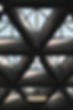
Grid
"By using a grid to inform the position of different elements on a page, you'll create a connection between the different elements that make up your page. This can help provide a sense of order to your layout, providing the reader with a clear structural reference to fall back on, and increasing the success of your page.
This is important because when all your page elements have a feeling of connectivity with each other, the overall effect feels more comfortable to the reader, helping to put them at ease, and facilitating their access to the important stuff: the content."

Layout Design Principles
Knowledge Is Power